Parts
Add parts from the Add bar above the canvas, or ready-made pieces from the left panel's Library tab. Every part has a position, size, rotation, opacity and glow, can be hidden or locked, and can show live data.

📦 The parts
| Part | Use it for | Highlights |
|---|---|---|
| Shape | Panels, badges, backgrounds | Box, circle, polygon or star; outline; fade fill; fill up with a value (with a soft edge) |
| Text | Speed, labels, names | 7 fonts, weights up to Black, italic, capitals, zero-padding, a smaller unit on the same baseline |
| Icon | Status icons, warning lights | 40+ icons; a second colour when on, blinking; fill up with a value |
| Bar | Health, fuel, rpm strips | Any direction, rounded, slanted, segmented, fade colour, red zone |
| Arc | Rings and dial sweeps | Any angle, segmented, fade along the arc, red zone, a tip marker at the end of the fill |
| Path | Bent gauges and custom shapes | Free points you drag on the canvas, rounded corners, open (fills along the line) or closed (a filled shape) |
| Scale | Tick marks and numbers | Around an arc or straight, majors and minors, numbers, red from a point |
| Needle | Classic dials | Start / end angle, length, tail and hub |
| Image | Weapon images, logos | The equipped weapon's image, or any nui:// or https:// image |
| Lights | Indicator strip | The HUD's own indicators, hazards, low / high beam, cruise and seatbelt lights, exactly as in the built-in speedometers |
⚡ Ready-made pieces
The Library tab (left panel, or Library on the add bar) has finished pieces that drop in with one click. Use the search box, or pick a shelf:
- Badges: Six stat badges in 7 looks: lit squares, rings, filled circles, tinted squares, lit hexagons, filling icons and percent pills.
- Pieces: Lights strip, fuel pill, big speed, odometer, gear badge, ring gauge, segment bar and bent gauge.
- Speedometers, Electric, Status, Weapons, Every built-in style, as editable parts.
Pieces arrive grouped, see Shortcuts → Groups.
🎨 Colours
Colours can be theme colours (Accent, Text, Dim text, Muted text, Inactive, Panel, Dial face, Success, Warning, Danger, Info) or fixed colours with any opacity.
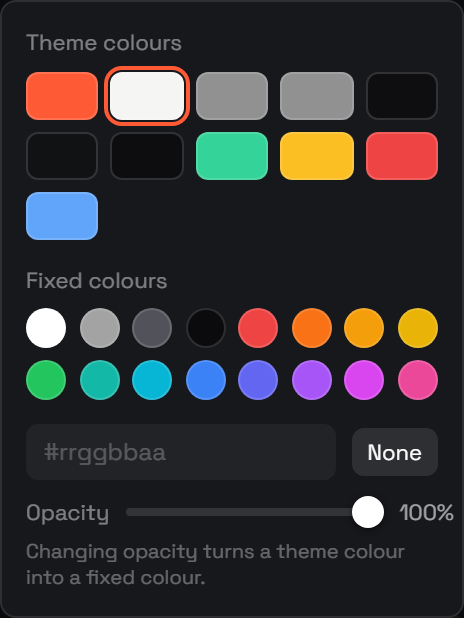
Use theme colours wherever you can. They follow the player's theme and colour tweaks, so one design looks right with every theme.
🖊️ Drawing any shape
Use a Path:
- Add a Path and pick a preset, Straight, Bend, Arch, Zigzag, Step, Triangle, Slant or Chevron.
- Drag the white points to reshape it. Points snap in line with each other.
- Drag a small dot between two points to add a corner. Double-click a point to remove it.
- Tick Closed shape to fill it, and use Round to soften the corners.
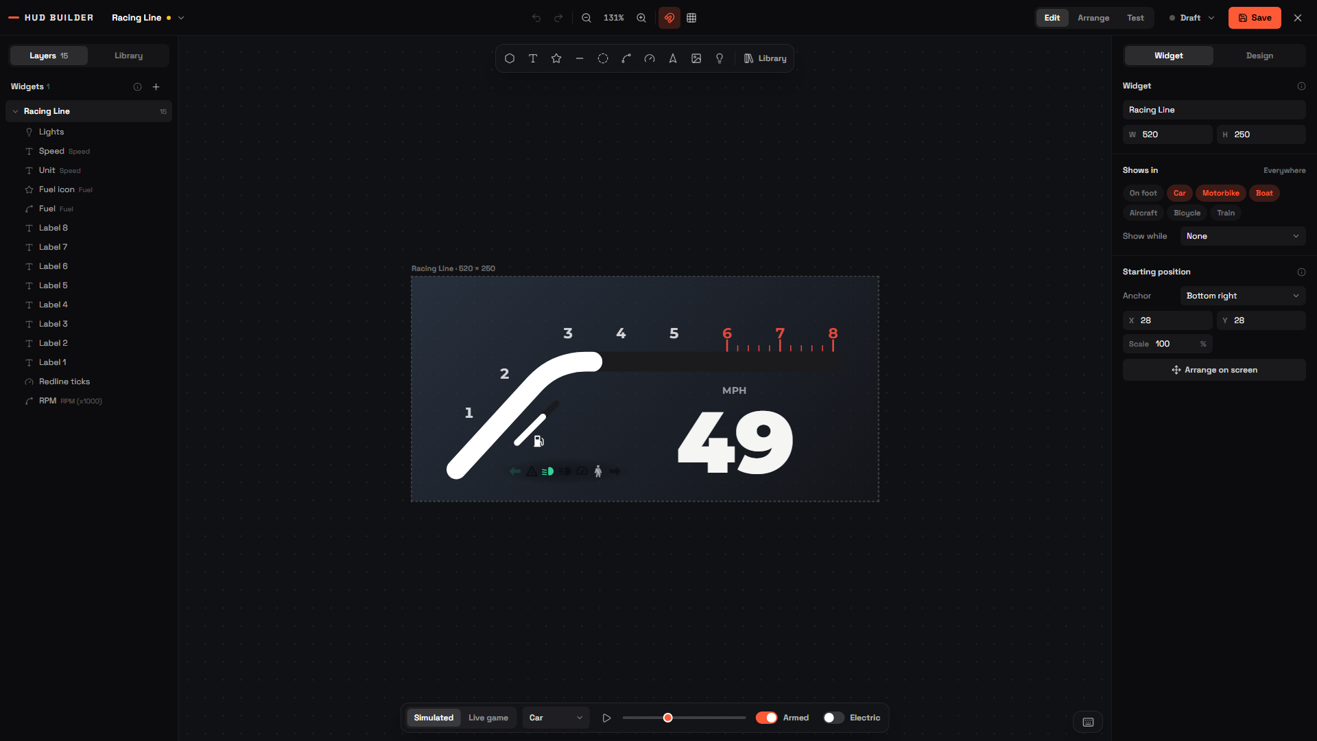
An open path bound to a value (like RPM) fills along its line, that's how the Racing Line speedometer is built.